

Remote teams don't have time for clunky software and confusing onboarding. Team Inc. knew that — and needed a site that proved it from the first scroll. We built a focused, photography-led marketing site designed around one outcome: getting the right people to sign up before launch. No bloat, no feature dumps, no generic SaaS filler. Just a clear message, a confident visual identity, and a conversion path that removes every reason to hesitate.
The collaboration tools market is crowded and most of it looks the same. Busy dashboards, endless feature lists, and stock-photo aesthetics that say nothing about the product behind them. Team Inc. had a genuinely strong platform and a narrow window to make a first impression. The site needed to stand out immediately, communicate credibility without a track record, and convert visitors who were still deciding whether the product was worth their time.
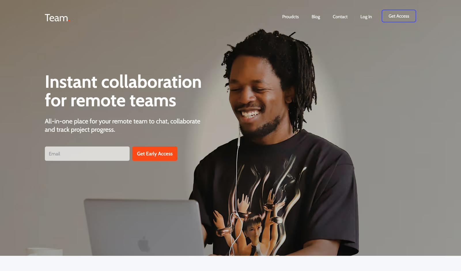
We started with the outcome and worked backwards. One conversion goal — early access sign-ups — shaped every layout decision, every headline, and every CTA placement. Photography over illustration. White space over noise. A single, unmissable action above the fold. The Webflow CMS was built in from day one so the founding team could keep the site fresh with blog content and copy updates without ever touching a developer.
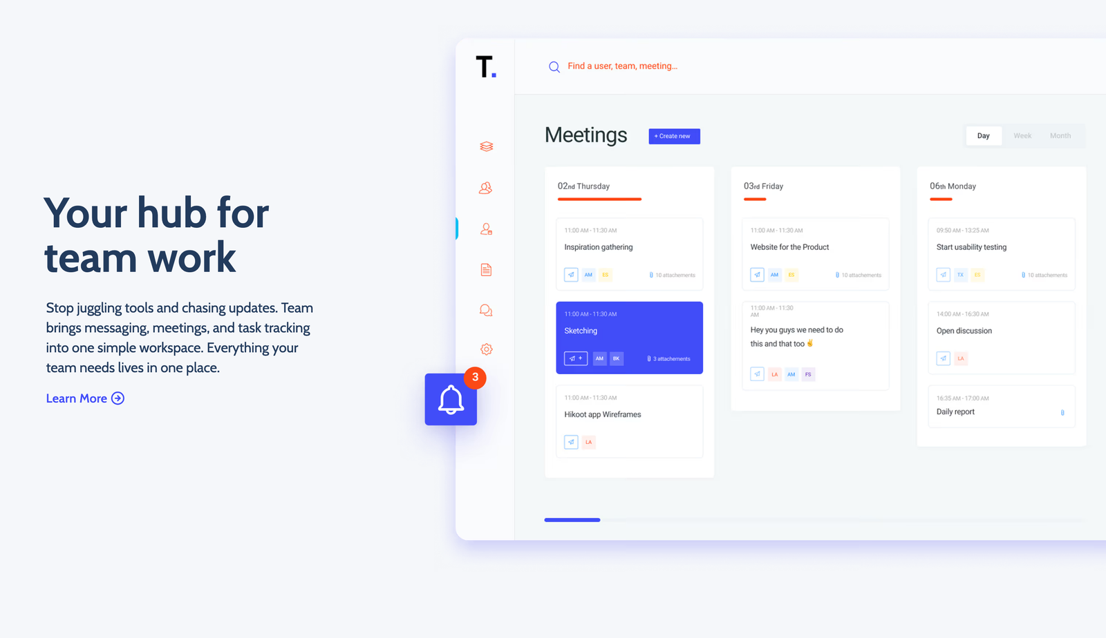
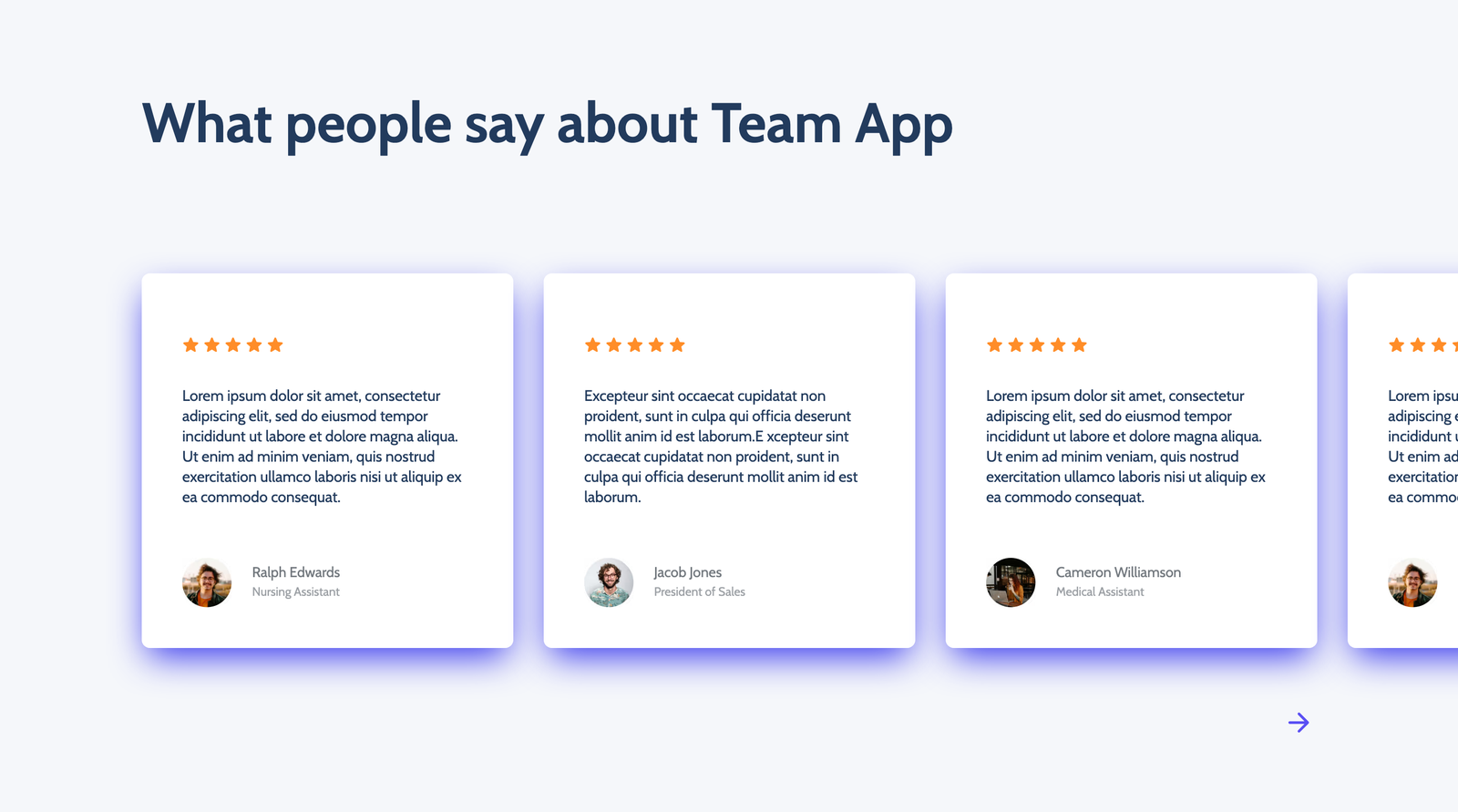
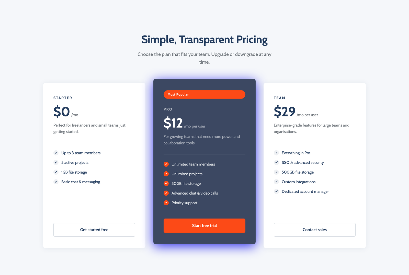
A fully responsive, CMS-powered Webflow site that loads fast, reads cleanly on every device, and positions Team Inc. as a product worth betting on early. The hero earns attention in under three seconds. The benefits section answers objections before they form. The sign-up form removes every point of friction. Interactions are intentional and lightweight — nothing that slows the page or distracts from the conversion. This is what a product launch site should look like.
Working with TJ Yield Studio didn't just deliver a website — it delivered a competitive advantage. In two weeks, Team Inc. went from a brief on a page to a live, fully responsive Webflow site that converted 68% of launch-day visitors into early access sign-ups and loaded in 1.2 seconds on mobile. Every design decision was made with one outcome in mind: turning the right visitors into believers before they had a reason to leave. The CMS handoff meant the founding team was publishing content independently within 24 hours — no developer dependency, no ongoing costs, no bottleneck. For an early-stage product competing in a crowded market, that kind of execution speed and conversion performance isn't a nice-to-have. It's the difference between building momentum and losing it. If your platform deserves a site that works as hard as your team does, this is what that looks like.
