
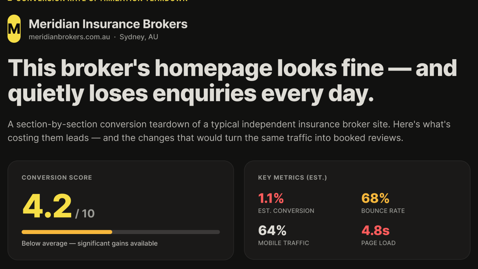
Most insurance broker websites aren't broken. They load, they look tidy, they have an About page and a contact form. And they still quietly lose enquiries every week, because looking professional and converting a cautious prospect into a booked call are two completely different jobs.
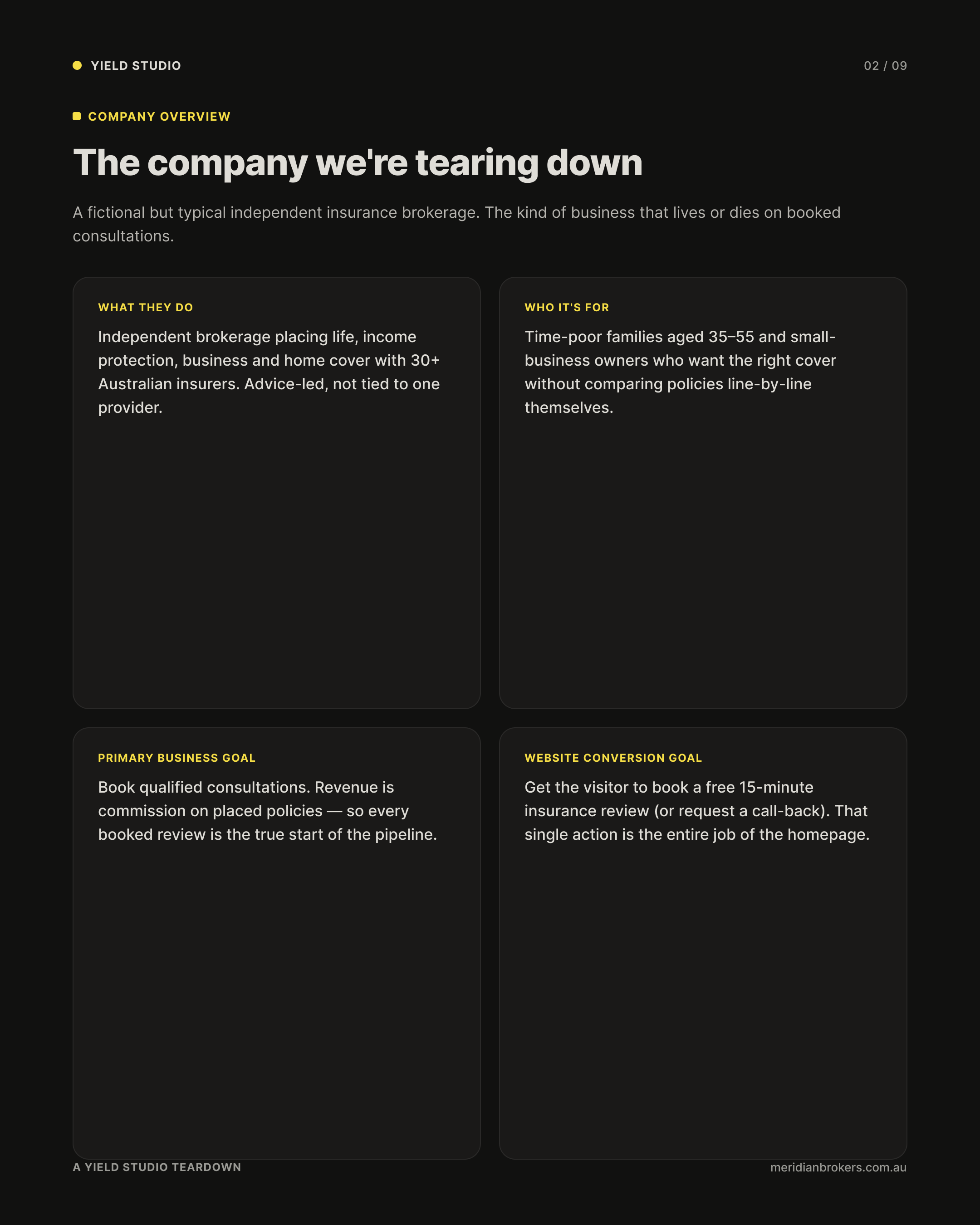
To show the difference, we ran a full conversion teardown on a fictional but completely typical independent brokerage called Meridian Insurance Brokers. Every issue below is one we see on real adviser and broker sites constantly. None of them needs a bigger ad budget to fix. They need a homepage that does its one job: turn a visitor into a booked review.
A tidy site and a converting site are not the same thing
Here's the uncomfortable part for anyone who has just paid for a website. Prospects judge you on it almost instantly, and mostly on how it looks. A landmark study by Lindgaard and colleagues found people form a durable visual impression of a web page in about 50 milliseconds, faster than a conscious thought. Stanford's Web Credibility research went further. When users judged the credibility of sites, 46.1% of their assessments came down to visual design, and finance was among the categories judged most harshly on look and feel.
For a broker, that isn't vanity. You sell trust before you sell a policy. If the homepage reads as a generic template, the visitor quietly concludes the advice behind it is generic too, and they're gone before they've read a word.
Speed is a revenue line, not an IT detail
The Meridian homepage we tore down loaded in an estimated 4.8 seconds behind a heavy hero image. That single number costs more enquiries than most brokers realise. Google and Deloitte's “Milliseconds Make Millions” study found that just a 0.1-second improvement in load time lifted lead-generation progression to the form-submission step by 21.6%. That isn't a redesign. It's a tenth of a second.
The drop-off is steepest exactly where brokers live. Portent's analysis of B2B lead-generation sites found a page that loads in one second converts roughly three times higher than one that loads in five, with conversion rates sliding from about 40% at one second to 29% by the third. And it compounds on mobile, which is now around 59% of all web traffic. A slow, image heavy hero punishes you most on the device most of your prospects are holding.
One page, one job, one button
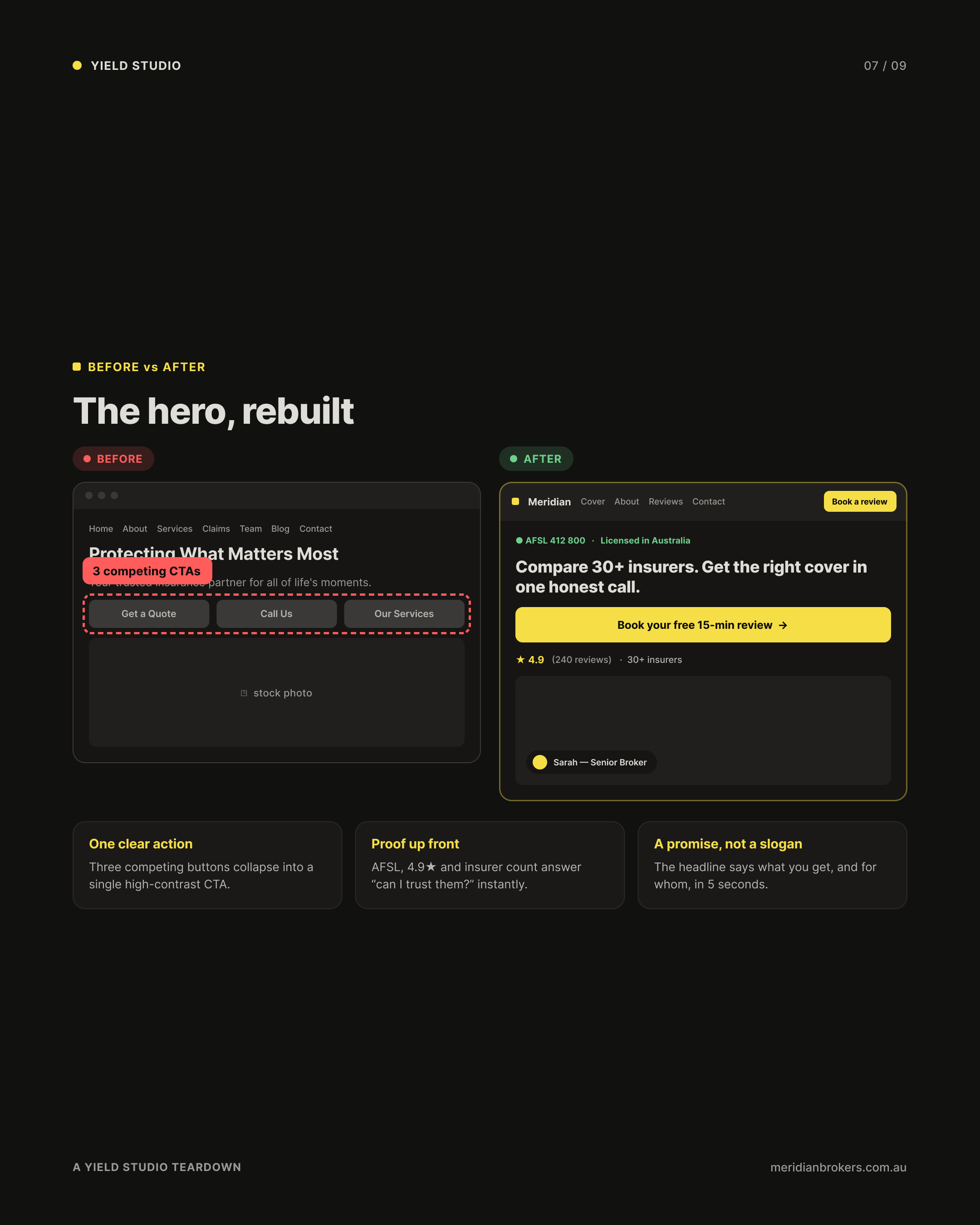
The Meridian hero offered three equally weighted buttons: “Get a Quote”, “Call Us” and “Our Services”. It feels helpful. It isn't. The Nielsen Norman Group's work on Hick's Law is blunt about why. The more choices you put in front of someone, the longer they take to decide, and the more likely they stall and do nothing. Three co-equal calls to action don't triple your chances. They split your visitor's attention and lower clicks on all three.
The fix is to decide, on the visitor's behalf, what the single most valuable next step is. For a broker, that's almost always “book a free 15-minute review”. Make that one action impossible to miss, repeat it down the page, and pin it on mobile. Everything else, like phone, services and claims, becomes secondary, where it belongs.
.png)
Your enquiry form is the silent dealbreaker
If a prospect does reach the form, length is where you lose them. Meridian's enquiry form asked for eleven fields up front. Baymard Institute's checkout research, the most rigorous in the field, found the average form runs to 11.3 fields when most need only eight, and that 17% of users abandon outright because the process feels too long or complicated. The key finding is that it's the number of fields, not the number of steps, that drives abandonment.
For an insurance enquiry, you don't need eleven fields to start a conversation. You need a name, a contact number, and the type of cover they're after. Everything else can be gathered on the call you're trying to book. Cut the form to three fields, set the expectation that you'll call back within two business hours, and you remove the two biggest reasons people quit.
Trust isn't a section, it's the whole page
This is where your background matters more than your designer's. Risk-averse buyers, and insurance buyers are about as risk-averse as they come, look for proof before they commit. The Meridian homepage showed none above the fold. No AFSL licence number, no insurer logos, no ratings, no real faces. Just stock photography of a smiling family that could belong to any firm in the country.
Trust signals aren't decoration. For a regulated adviser they're a conversion mechanism. Your AFSL number in the header, a visible review rating, the insurers you work with, and a real photo of the actual broker do more for conversion than any amount of polish. Compliance, shown well, is a selling point. Most sites bury it in a footer instead of using it as the reassurance it is.
When a template homepage genuinely is fine
Now the honest counter-case, because the answer isn't “always spend more”. If you're a brand-new broker validating whether you'll even stick with the business, a clean template you can launch this week is the right call. Proving the model matters more than a custom build. The same is true if your enquiries come almost entirely from referrals and your site is just somewhere to confirm you exist, or if you simply don't yet have the case studies and reviews a high-converting site needs to show.
The mistake isn't using a template. The mistake is choosing one by default, then pointing paid traffic or your hard-won referrals at a page that was never built to convert them. A template is a fine starting line. It's an expensive place to stay once enquiries actually matter to your revenue.
The five-minute test you can run today
Open your own homepage on your phone, give it five seconds, then look away. Then ask yourself:
- Could a stranger say what you do, who it's for, and why you? If the headline could belong to any broker, rewrite it to name the reader and the offer.
- Is there exactly one obvious next step? If you have two or more equally weighted buttons, demote all but one.
- Is your proof visible without scrolling? AFSL number, a rating, insurer logos and a real face, all above the fold rather than buried in the footer.
- How many fields does your enquiry form ask for? If it's more than four to start, cut it.
- Did it load before you got impatient? If not, your hero image is probably the culprit.
Most brokers fail at least three of these, and every one is fixable without a full rebuild.
The bottom line
A broker website earns its keep one way: by turning visitors into booked conversations. The gap between a 1.1% conversion rate and a realistic 3% isn't a bigger marketing spend. It's a clearer headline, a single call to action, visible proof, a shorter form, and a faster page. That works out to roughly 2.7 times the enquiries from the exact same traffic you're already paying for.

The reason most sites in this niche underperform isn't a lack of effort. It's that they were built by people who have never sat in a compliance conversation, for a buyer whose entire decision runs on trust. Get those two things to meet on the page, and the homepage starts doing the selling for you.
Want to know where your own site is leaking enquiries? I'll run a free Advisor Website Conversion Audit, a 20 minute, no obligation review that shows you, section by section, exactly where your homepage is losing prospects and what to fix first. Book your free audit here.
Sources
- Lindgaard et al. Attention web designers: You have 50 milliseconds to make a good first impression. tandfonline.com
- Stanford Web Credibility Project (Fogg et al., 2002). credibility.stanford.edu
- Google and Deloitte, Milliseconds Make Millions (via web.dev). web.dev
- Portent, Site Speed Is (Still) Impacting Your Conversion Rate. portent.com
- Statista, Share of mobile device website traffic worldwide. statista.com
- Nielsen Norman Group, Hick's Law: Designing for Long Menu Lists. nngroup.com
- Baymard Institute, Checkout Optimization: Minimize Form Fields. baymard.com