
You're getting visitors. The analytics look fine. But the enquiries aren't coming — and you can't see why.
Here's the uncomfortable truth: for a financial services website, the problem usually isn't traffic. It's what happens in the first 8 seconds after someone lands. A first-time visitor decides whether to trust you almost instantly, and most advisor sites quietly fail that test before a single paragraph gets read.
This isn't about being prettier. Your clients are risk-averse by nature — that's the whole reason they're hiring an advisor. Your website's only job is to make a careful person feel safe enough to take the next step. When it doesn't, they don't complain. They just leave.
The 8-second trust test
Open your own site right now — on a laptop and on your phone — and look at it the way a stranger would. In those first few seconds, here's what they're actually judging:
1. Does your headline state an outcome, or just say hello? "Welcome to [Firm]" tells a visitor nothing. "Independent financial advice for pre-retirees in Sydney" tells them exactly who you help and what they get. Name the outcome.
2. Is there a real human face above the fold? Not a stock handshake. Not a glass tower. Trust-driven clients buy the person before the firm — your actual photo beats any graphic.
3. Is it clear within five seconds who you help? "Financial planning for everyone" is invisible. The more specifically you name your ideal client's situation, the more that client leans in and thinks this is for me.
4. Is there one obvious next step? A single, clear call to action above the fold. If a visitor has to hunt for what to do next, they don't hunt — they bounce.
5. Does the page load in under three seconds? Every extra second loses people. Worse, a slow site reads as "outdated" — a dangerous signal for a trust business.
6. Does it look like a template ten other advisors use? Generic is a quiet red flag to a careful buyer. Your site should feel like you, not a theme someone bought for $49.
Get those six right and you've passed the part of the journey where most sites lose the client. For the deeper design thinking behind each of these, see our design principles for high-converting finance websites. Everything else — credentials, testimonials, your contact form — only matters if the visitor stays long enough to see it.
Why "interested but not ready" is where the money leaks
Here's the part most advisors miss. Even on a site that nails those first six checks, the majority of qualified visitors still aren't ready to book a call on day one. They're cautious. They're comparing. They want to feel like they understand you before they pick up the phone.
If your only call to action is "Book a Consultation," you're capturing the small slice who are ready today and silently losing everyone else.
The fix is to give the cautious visitor a lower-stakes door: a guide, a checklist, something genuinely useful they can take away without handing over a meeting. It keeps you in their world while they warm up — and it turns a one-time visit into a relationship.
Score your own site in ten minutes
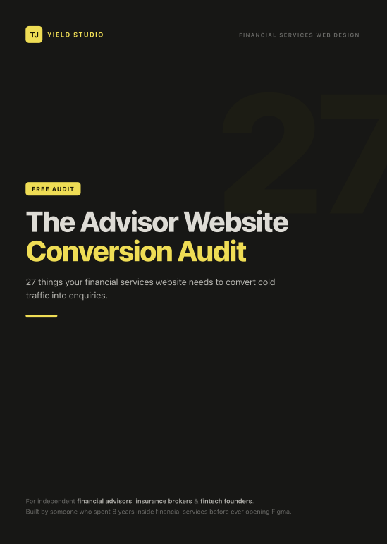
I built a free checklist that walks through all of this — 27 specific checks across first impressions, credibility and compliance, messaging, social proof, lead capture, and mobile. No email wall, no pitch. Open your site next to it, tick what you pass, and you'll have an honest score and a clear list of the highest-ROI fixes by the end.
👉 Download the Advisor Website Conversion Audit (free PDF)
Most financial services sites score in the "decent foundation, leaking leads" range — which is good news, because nearly every item on the list is about structure and trust, not budget.
Want a second pair of eyes?
If you run through the audit and want someone to look at your actual site, I'll record a short, free Loom walking through exactly where it's leaking trust and leads — no pitch, no obligation.
Book a free strategy call and I'll walk through exactly where your site is leaking trust and leads. Prefer LinkedIn? Connect with me there.
TJ — Yield Studio. Webflow + brand design for financial advisors, insurance brokers and fintech founders. Built by someone who spent 8 years inside financial services before ever opening Figma.